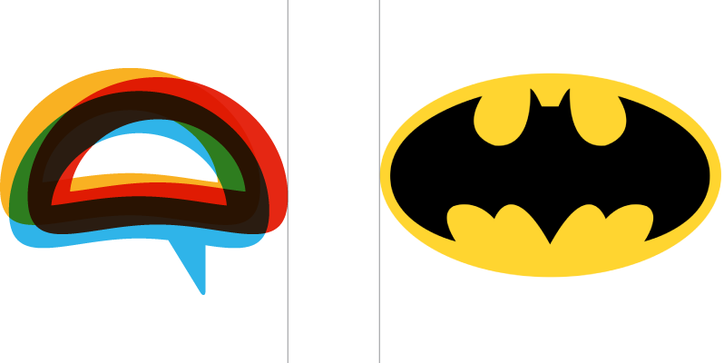
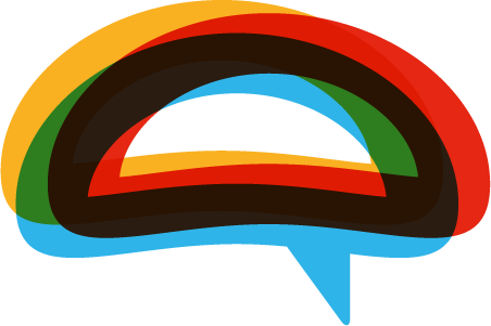
The brand


The '3-brain' logo concept revolves around the following principles, which are the foundation of our company:
It took around two months of going back and forth with many ideas. When we decided upon the '3-brain' concept, adjustment and detail played a big part to have our brand as you know it today.


RGB 47 180 233
HEX #2FB4E9
RGB 249 177 34
HEX #F9B122
RGB 229 39 19
HEX #E52713
We use Pantone & CMYK for offset printing, and just the latter for else.
Pantone 298 U
CMYK 69 7 0 0
CMYK 63 73 70 88
Pantone 137 U
CMYK 0 35 90 0
CMYK 84 25 100 12
Pantone 1795 U
CMYK 0 94 100 0
Roboto has a dual nature. It has a mechanical skeleton and the forms are largely geometric. At the same time, the font features friendly and open curves. While some grotesks distort their letterforms to force a rigid rhythm, Roboto doesn’t compromise, allowing letters to be settled into their natural width. This makes for a more natural reading rhythm more commonly found in humanist and serif types.
VIRTUALMIND
Exo was used for the construction of our logo...

With some reshaping!
Headings go light(er) with Roboto
I see a little silhouetto of a man
Another available option for headings is Exo
Gallileo Figaro. Magnifico!
Body text goes in Roboto
Is this the real life? Is this just fantasy? Caught in a landslide No escape from reality Open your eyes Look up to the skies and see I'm just a poor boy, I need no sympathy Because I'm easy come, easy go A little high, little low Anyway the wind blows, doesn't really matter to me, to me

We welcome you to use the isotype internally, always over a close-to-white background.

Also for internal purposes, 1-brain can be used. We rather try use first the Birdie Blue version.
With other logos around, a safe area is a must have.

In dark times, white is the answer.
Negative. Only when colors are known to be unavailable beforehand.

White or black also work on plain colored backgrounds. Like Indiana, choose wisely.
The corner logo is one of our favorites. But should be used in the fashion above.
For external material, the imagetype should be included somewhere.
Keep it straight, pal.
Better on top. Oh, your filthy mind.
It's all about contrast.
Seriously, contrast.
ONE WORD, one heart, let's get together and feel all right.
The contraction should not be used visually.

The logo and slogan, if used, should be readable.
Everytime time you strecht a logo, a designer dies somewhere. And a kitten, too.
You should burn in hell.
My eyes, my eyes!

Why did you think it was going to be good idea?
I will look for you. I will find you. And I will kill you.
Let's face it: you will be sending emails often. Our signature will give the perfect closure to your beautiful messages.
It comes in two flavors, use the second one if your name and title combined becomes too long.

Clark Kent Journalist
Virtualmind
www.virtualmind.com
North America (305) 433-6438
2134 Rivadavia Ave. Fl 3 Ste B - Buenos Aires, Argentina
ISO 9001 CERTIFIED / MICROSOFT PARTNER
Anthony Edward "Tony" Stark
Scientist & Philanthropist
Virtualmind
www.virtualmind.com
North America (305) 433-6438
2134 Rivadavia Ave. Fl 3 Ste B - Buenos Aires, Argentina
ISO 9001 CERTIFIED / MICROSOFT PARTNER
Just copy the text above, go to your Gmail account settings, in the general tab go to the signature section and paste it there.
Then just type in your name and position, make sure that the 'Insert this signature before...' option is checked, hit save and voilà!
If it doesn't end up looking like the above example, just say the word 'designer' out loud three times and help will come.